A Crash Has Two Regimes: When Your Diversifiers Work, and When They Don't
In a crash your stocks fall together — spreading across US, tech, small-cap and international barely helps. Whether the rest of a 'diversified' portfolio holds up depends on the kind of crash: bonds and gold hedge in a flight-to-safety shock, and fail in an inflationary one.
In a market crash, the broad slices of the stock market a typical portfolio holds — US large caps, tech, small caps, international — fall together, and spreading across them barely softens the blow. What actually decides whether a 'diversified' portfolio holds up is what the other things you own — bonds, gold — do while stocks are falling. And across every risk-off selloff since 2008 they have done one of exactly two things: in one regime the diversifiers work, in the other they fail. This is a description of what ten of those episodes show, on one basket — not a strategy, and not a forecast.
The worked example is a basket of 6 well-known ETFs — SPY, QQQ, IWM, EFA, TLT, GLD — the mix a retail investor would call diversified: US large caps, tech, small caps and developed-international stocks, plus long-term Treasuries and gold. Four of the six are the stock sleeve; TLT (Treasuries) and GLD (gold) are the intended diversifiers. Every number comes from the same correlation engine the product runs for any holdings you give it, on adjusted-close daily returns.
There is no 'diversified stock portfolio'
Start with the stock sleeve. Over the full period (2007–2026) the four stock ETFs already moved almost as one — an average pairwise correlation of 0.85, with SPY and QQQ alone at 0.92. US, tech, small-cap and international feel like four different bets, but they share one dominant driver — equity risk — so spreading across them was never really diversifying. In a selloff the number only tightens (0.90 in 2008, 0.84 in 2026). So the stock side is settled: these four converge every time, because they were one bet in four tickers to begin with. (A concentrated bet is the exception — a single sector like energy can rise in an oil-driven selloff even as the market falls — but that is not the broad mix most portfolios hold.) The real question is the diversifiers.
The two regimes
Bonds and gold are supposed to be what saves a portfolio when stocks fall — the pieces that zig when equities zag. Whether they do depends on the kind of shock, and there are two. A flight-to-safety shock is fear-driven — a credit freeze, a bank run, a pandemic, a growth scare: investors pile into Treasuries, so bonds rise as stocks fall, the stock-bond correlation goes negative, and the hedge works. An inflationary shock is the opposite — rates and inflation are the problem, so bonds fall with stocks, the correlation turns positive, and the hedge is gone. In calm markets the SPY–TLT correlation was -0.31 and SPY–GLD 0.06: mild diversifiers. What those two numbers do in a selloff is the whole story.
Every selloff since 2008, sorted by regime
The table tags all ten episodes by regime, following the sign of the stock-bond correlation: negative (bonds rose as stocks fell) is flight-to-safety; positive (bonds fell too) is inflationary. Seven of the ten were flight-to-safety, and bonds did their job. Three were inflationary — 2022, the 2023 bond-yield spike, and 2026 — and those three carry the only positive SPY–TLT figures in the table, and the three highest whole-basket correlations. The episodes range from small selloffs (-5.9% in the 2023 bank stress) to full crashes (-32.5% in 2008), and the split holds across all of them — this is how a stocks-and-bonds book behaves in any risk-off move, not just a crash.
| Episode | Regime | SPY–TLT | Basket avg | Drawdown |
|---|---|---|---|---|
| Full period | calm baseline | -0.31 | 0.30 | — |
| 2008 Financial Crisis | flight to safety | -0.47 | 0.24 | -32.5% |
| 2010 Eurozone Debt Selloff | flight to safety | -0.76 | 0.16 | -8.0% |
| 2011 EU Debt & US Downgrade | flight to safety | -0.70 | 0.15 | -8.8% |
| 2015–16 China & Oil Selloff | flight to safety | -0.45 | 0.20 | -10.4% |
| 2018 Q4 Selloff | flight to safety | -0.36 | 0.24 | -12.3% |
| 2020 COVID Crash | flight to safety | -0.50 | 0.32 | -22.5% |
| 2022 Rate & Inflation Drawdown | inflationary | 0.03 | 0.42 | -24.8% |
| 2023 Regional-Bank Stress (SVB) | flight to safety | -0.14 | 0.24 | -5.9% |
| 2023 Bond-Yield Spike Selloff | inflationary | 0.33 | 0.45 | -10.4% |
| 2026 Iran War | inflationary | 0.21 | 0.51 | -8.9% |
The split, in one picture
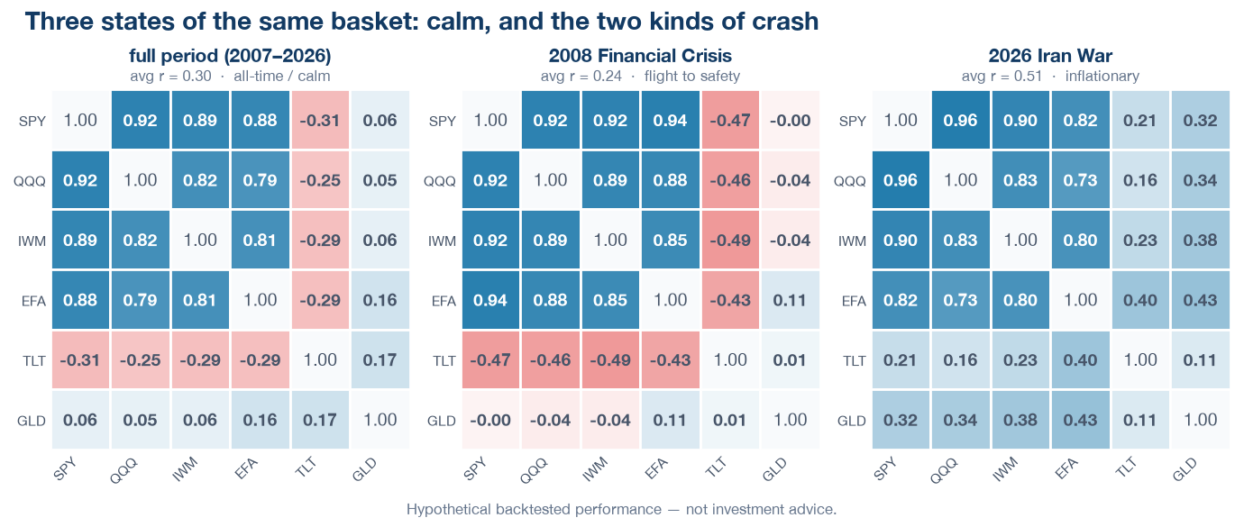
The heatmaps show three states of the identical basket: the calm full period, one flight-to-safety crash (2008), and one inflationary selloff (2026). Ignore the stock block — deep blue in all three, as expected. The story is the bottom two rows, TLT and gold. In calm they are mildly negative or near zero. In 2008 the TLT row turns deeply red: bonds hedged even harder than in calm, exactly what you want. In 2026 both rows turn blue: bonds and gold moved with the market, and nothing in a stocks-bonds-gold book was falling less. One basket, two opposite outcomes — set entirely by the regime.
The same split, over two decades
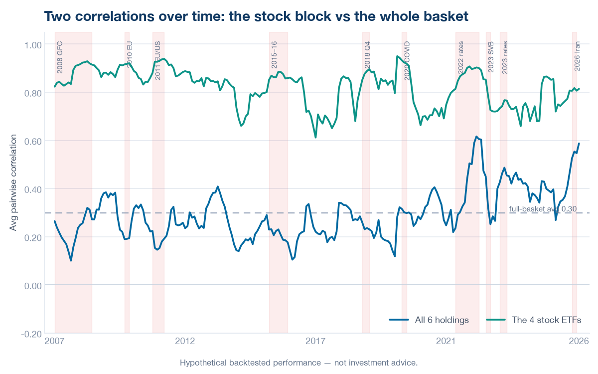
On a rolling window across the whole period, the two lines separate cleanly. The four stock ETFs (top line) sit high the entire time, calm or crisis. The whole six-holding basket (lower line) stays down inside almost every shaded episode — even the deepest — because the negative bond correlation holds it there. It climbs in exactly three places: 2022, the 2023 yield spike, and 2026, the three inflationary shocks. A diversified portfolio's correlation is not a straight line up in every selloff; it is flat-to-down in seven and up in three, and the three are the same kind.
2026: the regime at its limit
2026 is the inflationary regime at full stretch. Bonds failed to hedge (0.21) — and so did gold (0.32), the only episode in the whole history where the classic safe haven moved with the market rather than against it. The result was the highest whole-basket correlation of any episode, 0.51: for that stretch nothing in a stocks-bonds-gold book was falling less than the rest. 2023 had already shown both regimes could arrive in one year — the spring bank stress hedged and the basket fell only -5.9%, the autumn yield spike didn't — but 2026 confirms the inflationary regime is no 2022 fluke.
What the two regimes add up to
Two things hold across all ten episodes. Diversifying across broad kinds of stock does almost nothing in a selloff — they were one bet in four tickers to begin with. Diversifying across asset classes is real but regime-dependent: bonds and gold hedge in a flight-to-safety shock and fail in an inflationary one. 'Diversification fails in a crash' is too blunt; so is 'bonds always protect you.' The honest version: a stocks-and-bonds portfolio has a hedge that works against fear and not against inflation — and which kind the next selloff will be is not something the historical record can tell you in advance.
See how correlated your own holdings are
Correlation is one of the two things the free Portfolio X-ray runs live. Pick up to three well-known names and it shows how correlated they are and how concentrated the mix is, on the same adjusted-close-returns basis shown here. It runs equal-weight on a curated set of names, so treat it as a quick diversification check rather than the full regime analysis above — the crisis-window matrices, the stock-vs-basket split, and the scenario replays used here live in the full app.
Method & caveats
All correlations are computed on adjusted-close daily returns (dividends and splits reinvested — the engine's own basis, computed on adjusted-return basis) for the 6-ETF basket SPY, QQQ, IWM, EFA, TLT, GLD; the 'stock block' is SPY, QQQ, IWM and EFA. The full window runs 2007-08-28 to 2026-08-28 (as of August 28, 2026). The episodes are the ten curated risk-off episodes since 2008 from the scenario catalog — they range from small selloffs to full crashes; each shaded band is the episode's own catalog window, the same window the product's scenario replay uses. Correlation is measured over that window, except that a very short episode (the 33-day 2020 crash, the 39-day 2023 bank stress, the 62-day 2026 selloff) is measured over a span extended to roughly three months so the coefficient is statistically meaningful rather than a noisy matrix; the band still marks the actual episode. The regime label is an author classification that follows the sign of each episode's SPY–TLT correlation — a description of what the data did, not a claim about cause. The heatmap grid shows three states (calm, one flight-to-safety crash, one inflationary selloff) for readability; the table and the over-time line cover all ten episodes. The over-time lines use a 180-day centered rolling window stepped across the period; each point is a separate correlation computed over that window. The drawdown figures are the equal-weighted basket's peak-to-trough decline in each episode from the scenario replay, gross of fees, trading costs, slippage and cash yield. The crisis windows are fixed history; the full window rolls forward on a re-run, so its calm-period figures may shift slightly. This is one illustrative basket over these windows — a description of what the historical data shows, not a general claim, a forecast, or a recommendation, and past correlations do not predict future ones.