Total Return vs Price Return: The Gap Nobody Accounts For
A price chart shows what a share is worth. It doesn't show what a holder earned. On a real dividend payer over 20 years, the two numbers are worlds apart — and the difference is the reason our analyses use adjusted prices.
There are two ways to measure what an investment did, and they can disagree by a lot. Price return is the change in the share price alone — what a price chart shows. Total return adds the dividends the security paid, assumed reinvested, on top of the price change. For a security that pays no dividend the two are the same. For a dividend payer held over many years, the gap between them is large — and it is the part a price chart silently leaves out.
A worked example: VZ over 20 years
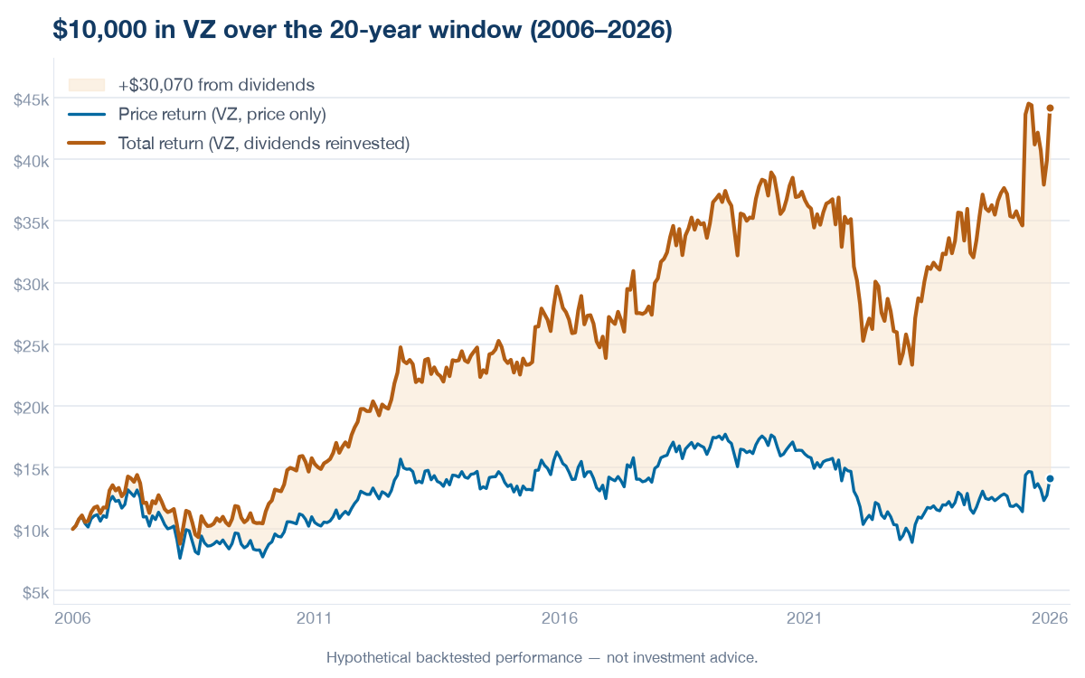
Take VZ over the 20-year window (2006–2026) (as of August 15, 2026). On price alone, the shares returned 41.0%. Measured as total return — the same shares, with dividends reinvested along the way — the figure is 341.7%. Same security, same window; the only difference is whether the dividends are counted.
Put in money terms: $10,000 tracking the price alone would have grown to $14,097. The same $10,000 on a total-return basis would have grown to $44,167 — a difference of $30,070, all of it from dividends and their reinvestment. Across the window, dividends accounted for 88% of the total return.
The numbers
| Measure | VZ over the window |
|---|---|
| Price return (raw close) | 41.0% |
| Total return (dividends reinvested) | 341.7% |
| $10,000 grown, price only | $14,097 |
| $10,000 grown, total return | $44,167 |
| Difference (from dividends) | $30,070 |
| Dividends' share of total return | 88% |
The two lines start together and separate a little more with every dividend paid and reinvested. By the end of the window the total-return line finishes 3.1 times as high as the price-only line — the shaded area between them is the compounding of dividends the price chart never shows.
Why this is the number that matters
A price chart answers 'what is one share worth?' — useful, but not what a holder actually earned. Total return answers the second question, and for a dividend payer it is the larger and more honest figure. This is why every performance figure in our analyses is computed on adjusted close — a price series adjusted for dividends and splits — rather than the raw closing price: it captures total return, so the number reflects what holding the security actually delivered rather than only the price line.
Run it on any ticker
The figures above come straight from the same adjusted-price data the tool runs on. Enter a symbol and a window below to see the total return of a security you follow, dividends included.
Method & caveats
All figures as of August 15, 2026 over the 20-year window (2006–2026) (2006-08-15 to 2026-08-14); a later re-run rolls the window forward and shifts the numbers. Price return uses the raw closing price; total return uses adjusted close (dividends and splits included), which assumes each dividend is reinvested in the same security on its ex-date. Figures are gross — no fees, trading costs, taxes on dividends, or slippage are modeled, and a taxable holder would keep less of the dividend portion. This is one dividend-paying security over one window — an illustration of the difference between the two measures, not a general claim, and past results do not predict future returns.